Selection Component
CASE STUDY Content Management UI/UX, Oracle
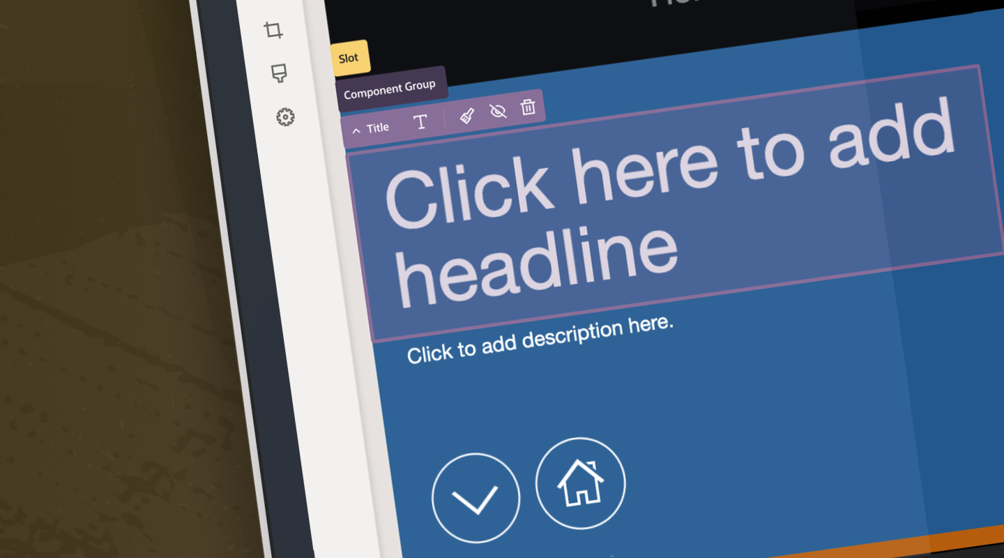
Create an operation that brings visibility to all available options–presenting primary and secondary actions simply and intuitively that prioritizes user’s core needs at every step of the site building process.
THE ASK
The objective for this project was to reimagine how the component selection experience worked within the OCM Builder environment. The project focused on the user experience and overall interaction with content during the site creation and management process.
The primary challenge was that the complete set of actions were not visible within the component. Users were not aware of additional functionality and the current selection component did not provide intuitive indiction of available actions. In addition, the visual elements were not consistent with the evolving design system, including iconography, color palette and product framework.
PROBLEM
Aligning the selection component with the evolving design system proved to a comprehensive product redesign that encompassed more than was originally anticipated. As we conceptualized the functional component, the overall framework and icon set for the UI needed to be re-examined as well.
Ultimately, the new component design informed the visual and structural design of the property panels and interaction for the entire builder environment.
SOLUTION
Requirements
Improve the UX for component selection within the product toolbar and component toolbar
Display available actions with greater visibility on a specific component
Ensure consistent asset create / select UX with targeted prioritized actions, minimizing less frequently used actions (while still keeping them accessible)
Provide deep links on the component toolbar
Provide fewer clicks for user to get to desired area
Clearer distinction between selected component areas
ORACLE CONTENT MANAGEMENT (OCM)
Product-specific palettes help ensure immediate recognition, while retaining the visual language of the Redwood Design System
Defining the Core Elements
The objective for this project was to reimagine how the component selection experience worked within the OCM Builder environment. The project focused on the user experience and overall interaction with content during the site creation and management process.
The primary challenge was that the complete set of actions were not visible within the component. Users were not aware of additional functionality and the current selection component did not provide intuitive indiction of available actions. In addition, the visual elements were not consistent with the evolving design system, including iconography, color palette and product framework.
SIGNATURE COLORS
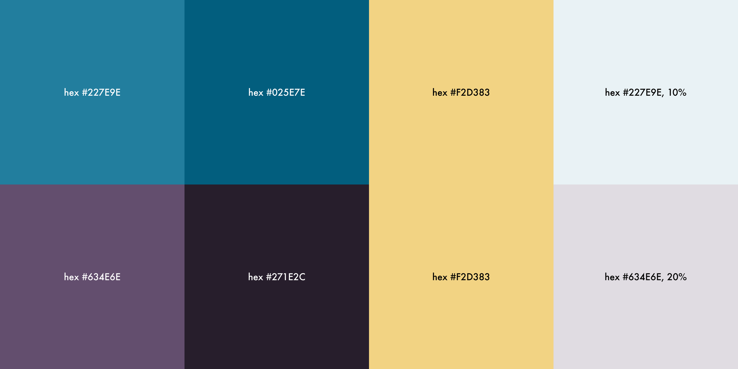
DEFAULT AND PRODUCT-BASED COLOR PALETTES
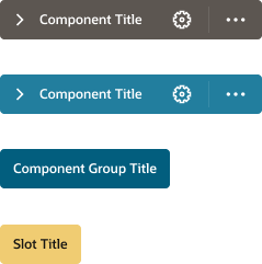
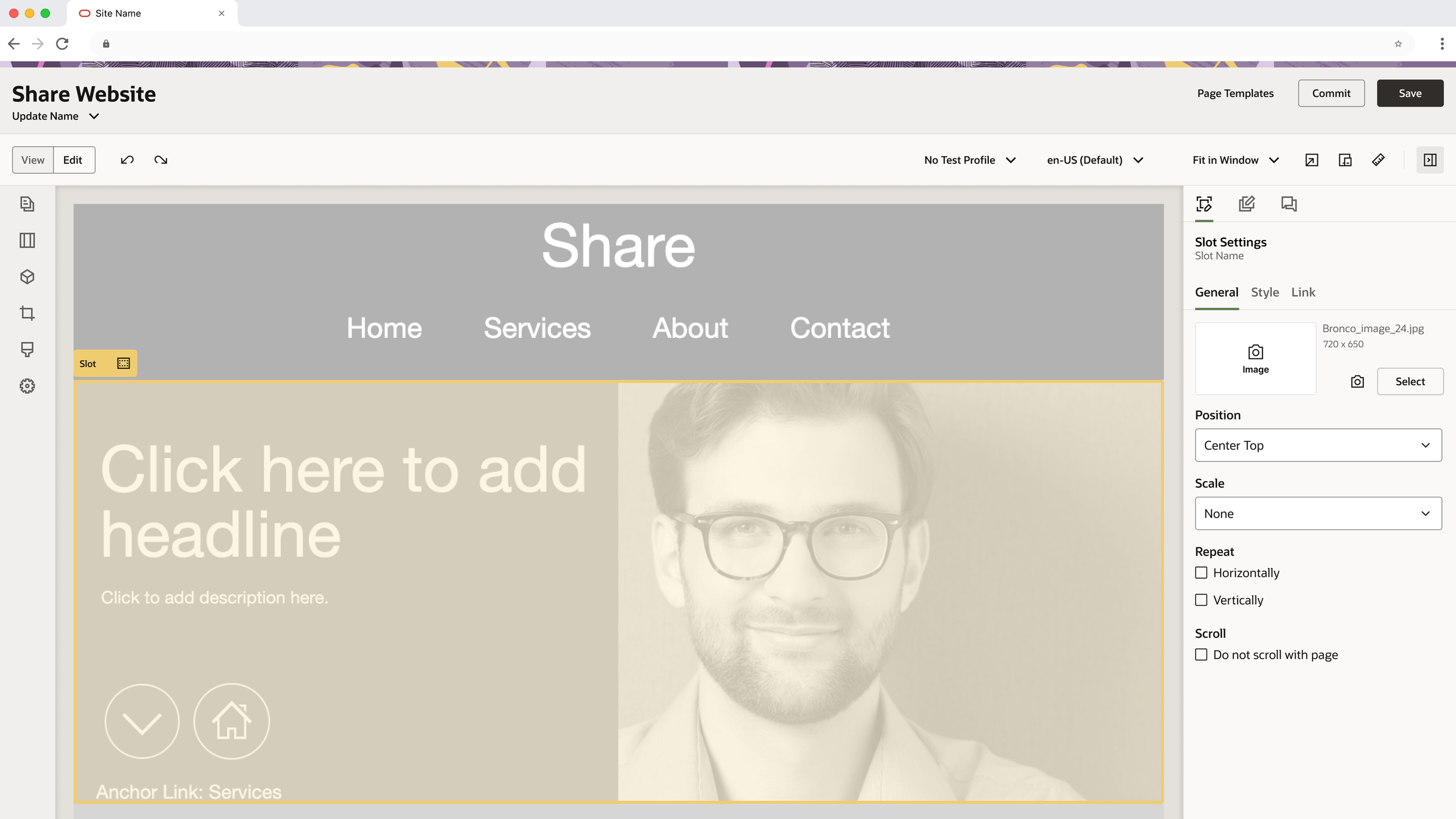
Colors are applied to quickly lidentify hierarchy between elements within the builder environment – Single Components, Component Groups
and Slots
Write something about the distinctions between them and easier brand recognition between products. Used for
Show all available actions for a specific component upon hovering over the individual bar. All primary and secondary actions are shown at once (for each tab respectively).
DELIBERATE USAGE OF ICONS
Primary and secondary actions are shown in order of priority for the available actions based of the selection
ICON PLACEMENT
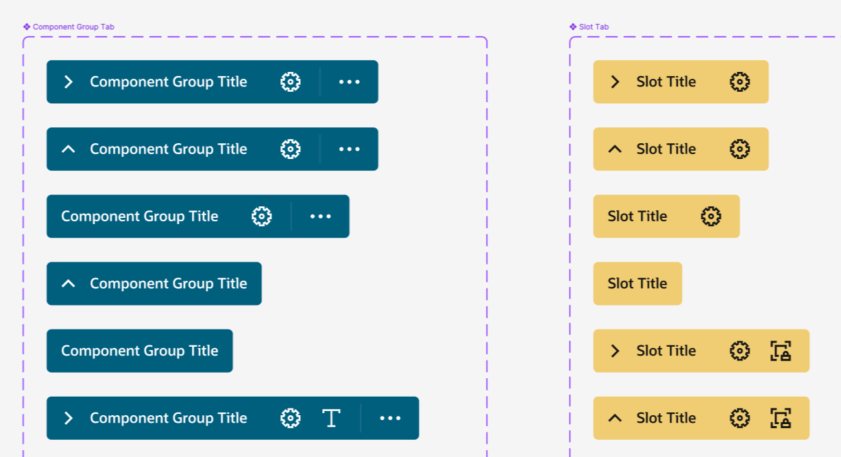
Secondary Actions
Primary Actions
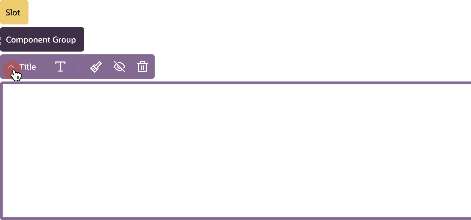
Chevron indicates the level of hierarchy between single components, component groups and slots
Defining Selection Behavior
The selection bar controls all of the actions taken on components. The selection bar appears when the user hovers over any component. To activate controls, the user clicks on the selection to reveal the tab options for the selected component.
HOVER STATE TO SELECTION
While hovering over a component on the canvas/page the user can select the component by either clicking on the action tab or anywhere on the selection area (translucent overlay. Once selected, the tab and marquee area will change from Neutral 130 to Brand 100, and the translucent glass will disappear to give greater visibility to the content contained within.
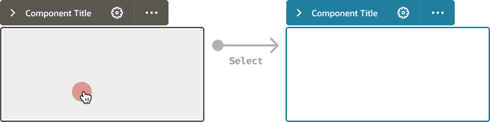
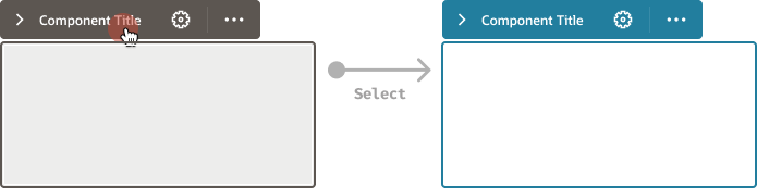

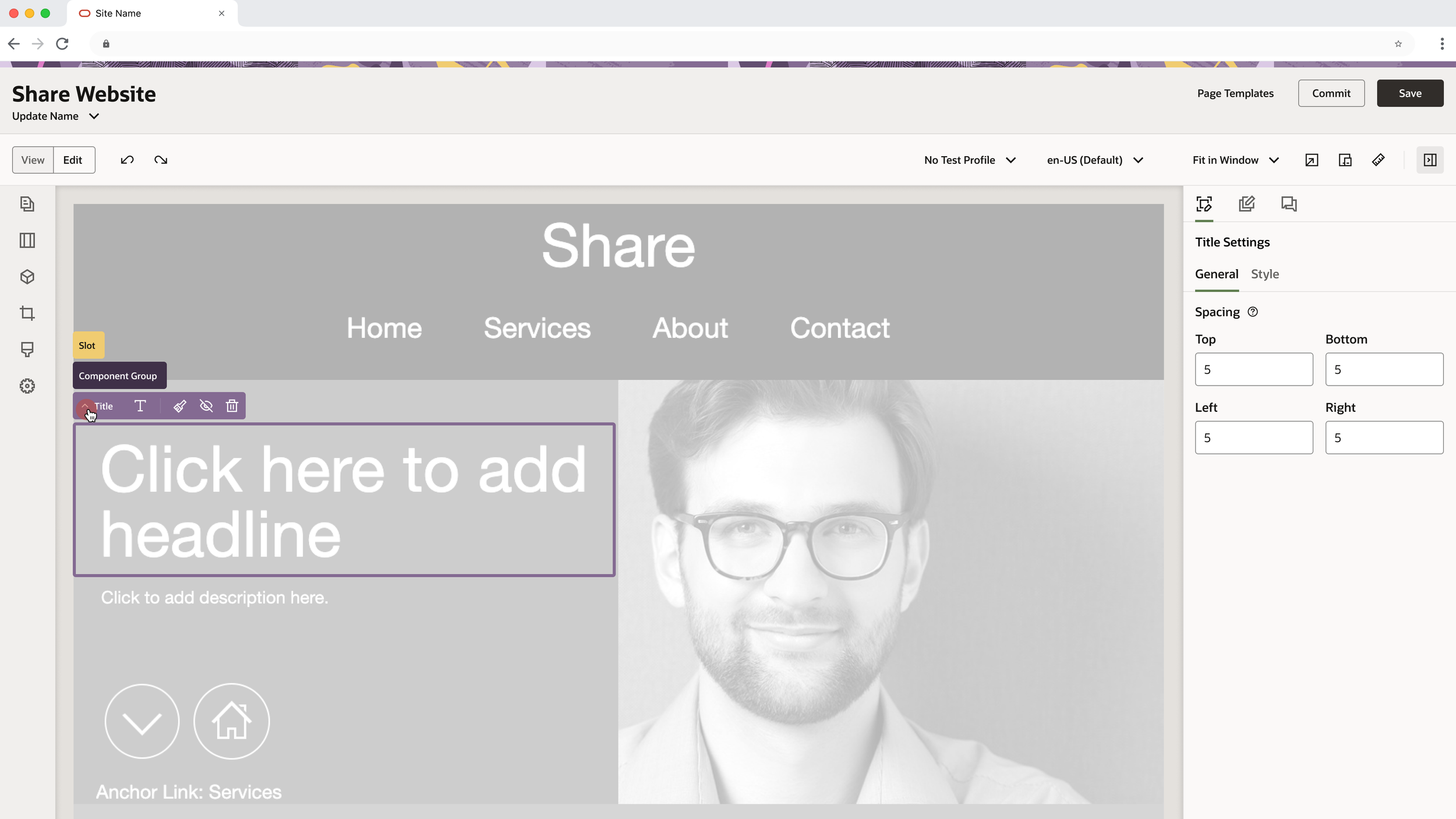
When user clicks on the chevron to the left of the component title, a visual hierarchical set of tabs expands, revealing concentric levels of containers, beginning from the primary component selected to the slot (largest containers on the page).
EXPANSION OF COMPONENT HIERARCHY
As a user hovers over the individual tabs revealed, all available actions for each level of components, Component Groups and Slots are made visible. Each tab expands to reveal available actions that can be taken immediately on a that particular component.
NAVIGATE AVAILABLE CTIONS
As a user hovers over the individual tabs revealed, all available actions for each level of components, Component Groups and Slots are made visible. Each tab expands to reveal available actions that can be taken immediately on a that particular component.
FOCUS ON INDIVIDUAL ACTION
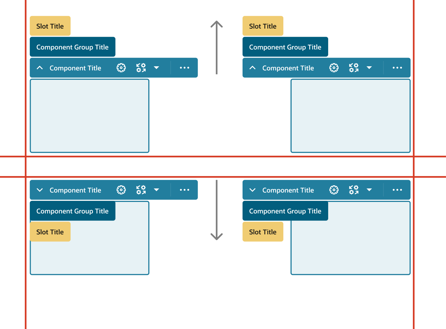
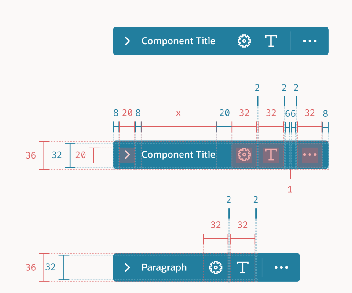
Accommodations
We created behavior where the action bar automatically responds to the position on the canvas, and expands accordingly to expand accordingly.
For maximum readability, we surfaced only the most frequent action icons on the bar as defaults, and kept the secondary actions in a dropdown, out of sight but always available.
Component Selection
Typical user interaction displaying the main actions and selection states across the builder environment.
-
![]()
OCM Builder Environment
BEGIN EDITING
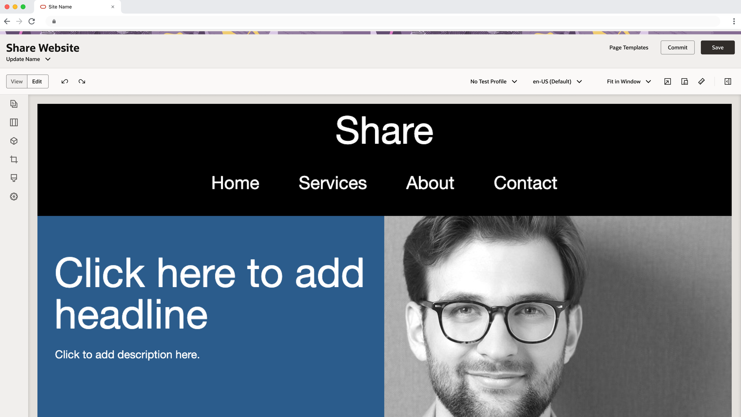
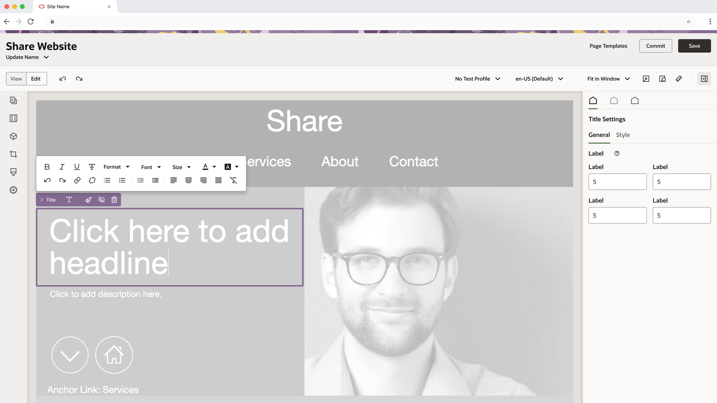
The content creator wants to make a few changes to the homepage, entering the live interface, they begin to make some edits in real time. -
![]()
Choosing a Component
HOVER STATE
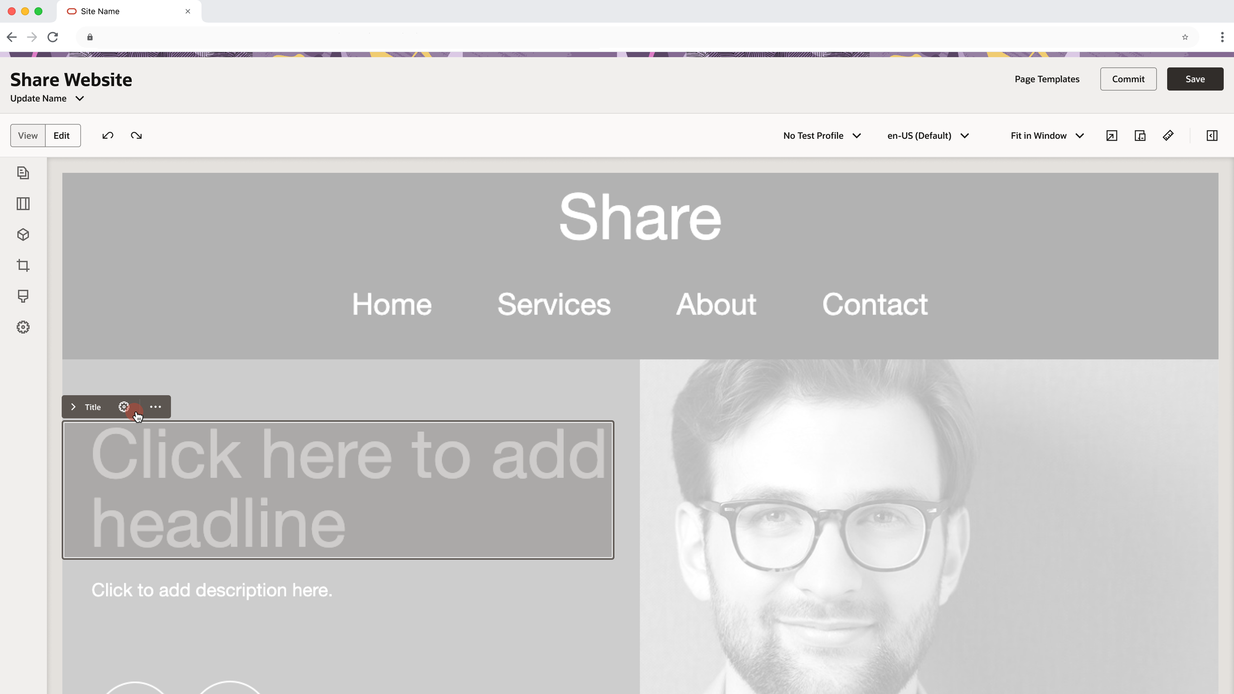
While hovering over a component on the canvas/page, the user can select the component by clicking anywhere within the outlined selection area. When in hover state, there is a translucent overlay in the selection area to help indicate the boundaries of the component. -
![]()
Component Selection
REVEALING PRIMARY ACTIONS
Once selected, the tab and marquee area will change from neutral to a product-specific brand palette, and the translucent glass will disappear to give greater visibility to the content contained within. -
![]()
Side Panel Expansion
CONTROL OF COMPONENT DETAILS
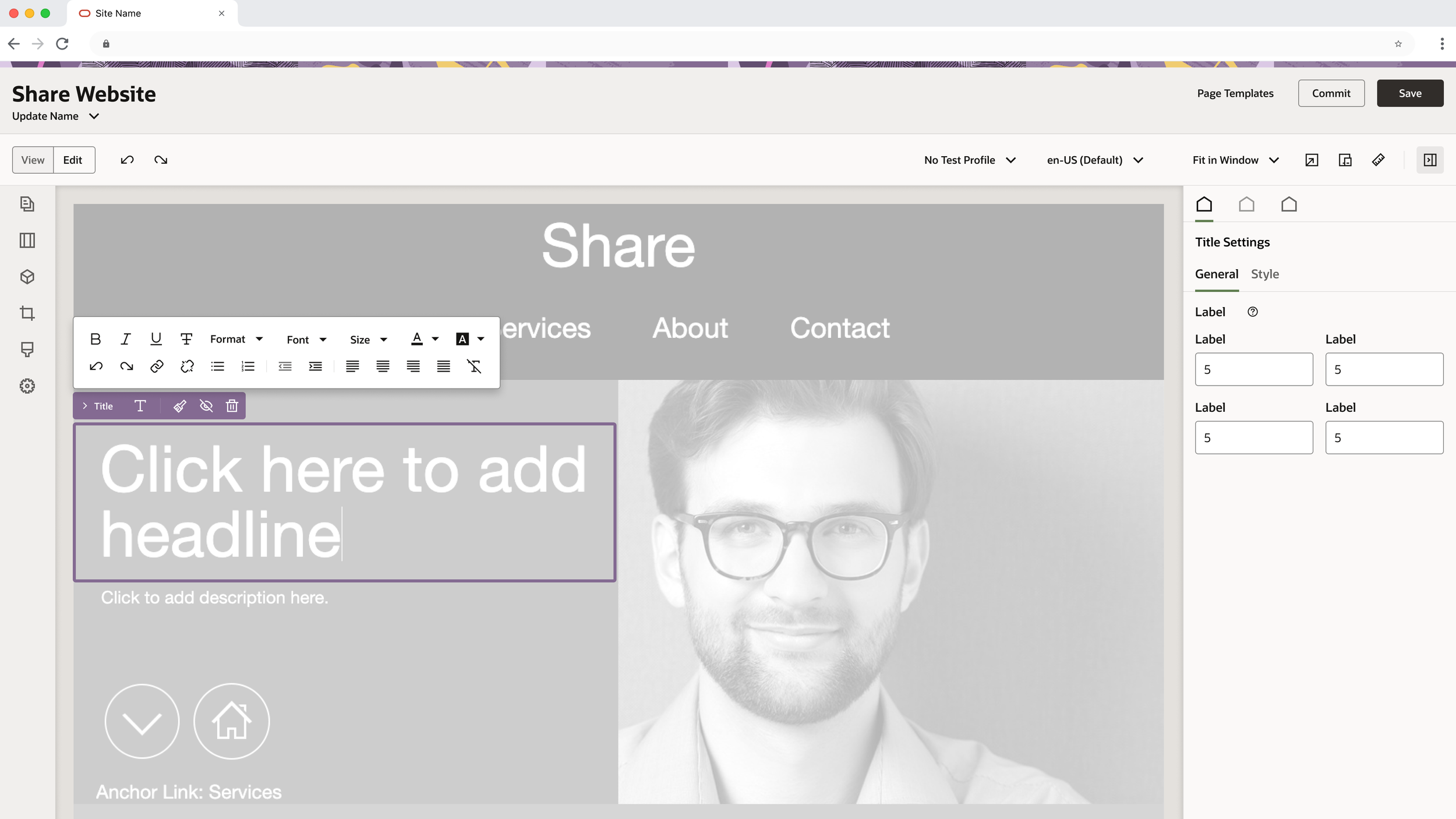
Detailed Side Panel expand to reveal controls specific to the Selected Component, Component Group or Slot.
-
![]()
Increased Context
EXPAND HIERARCHICAL STRUCTURE
User can expand the selection bar to reveal the Selected Component, Component Group, and Slot gain deeper insight into the nested component structure – making for much greater control over one’s content.
-
![]()
Color Coded Elements
INCREASED VISIBILITY
Color coded levels helps user immediately view the selected content within the structure of the page.
RESULTS