ERP Expense Illustrations
CASE STUDY Illustration Series Creation, Oracle
THE ASK
To elevate the mundane task of submitting expenses to make it more engaging and sophisticated?
Submitting expenses is among the most repetitive tasks a salesperson – or any employee can experience, placing line items into a form one after the other. How can employees embrace the submission process rather than dread it?
PROBLEM
The ERP team sought to tell a different story. Create a visually engaging submission process that could delight and encourage a friendly, light-hearted but sophisticated environment in which to operate.
SOLUTION
Requirements
I was tasked with creating a proprietary, product-specific set of images that helped define the experience of submitting expenses from any device.
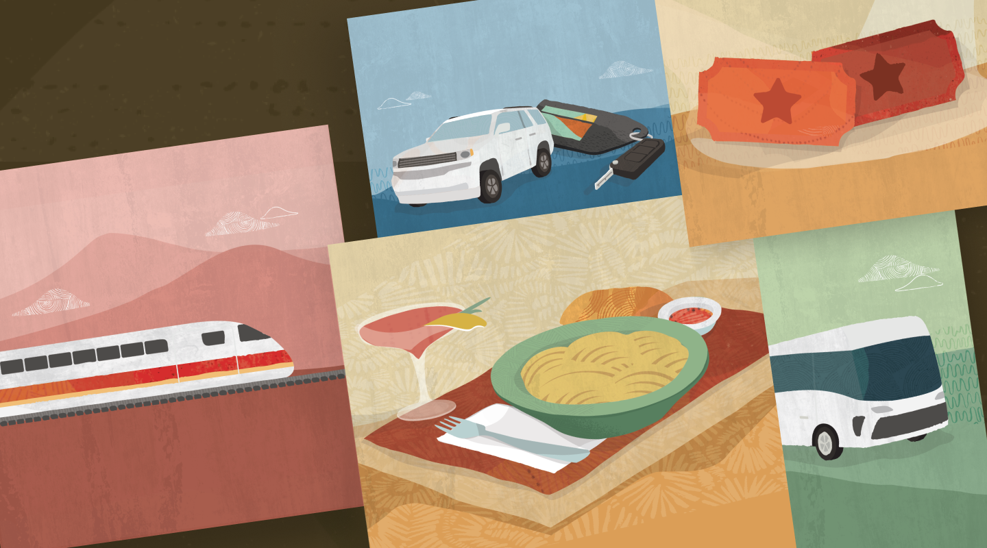
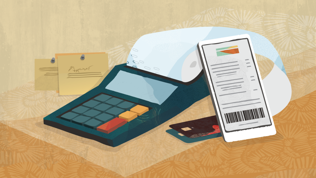
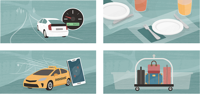
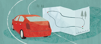
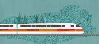
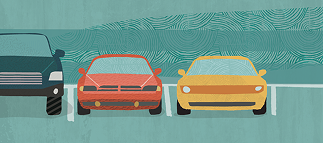
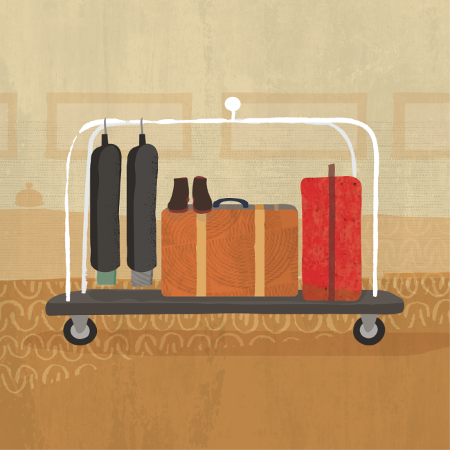
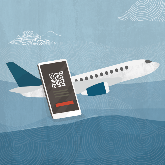
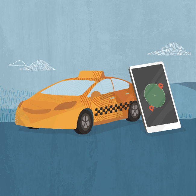
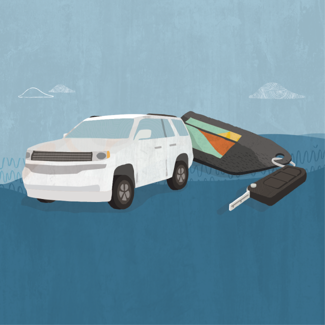
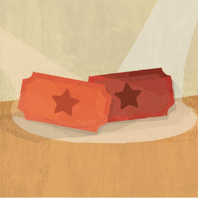
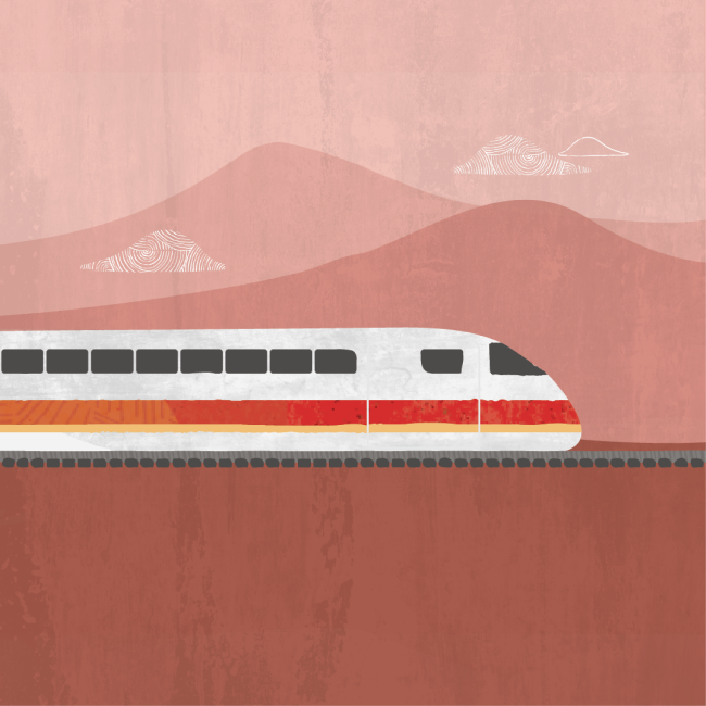
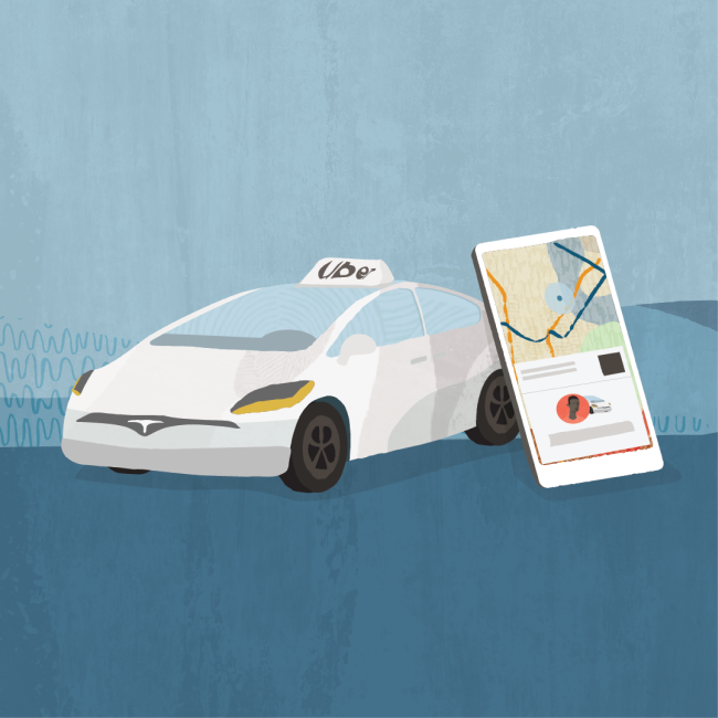
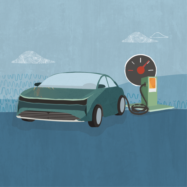
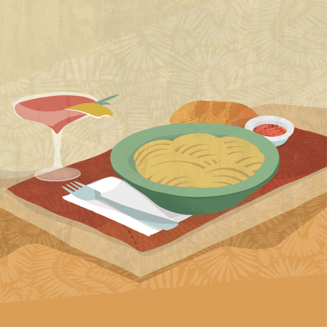
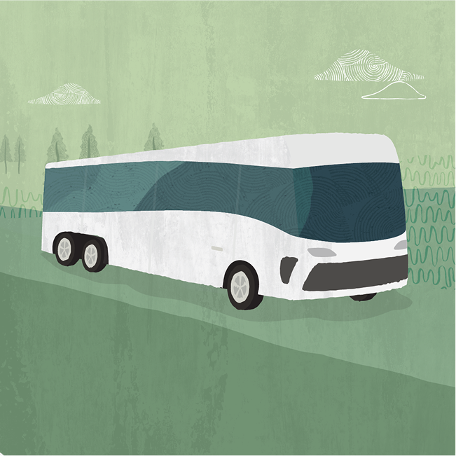
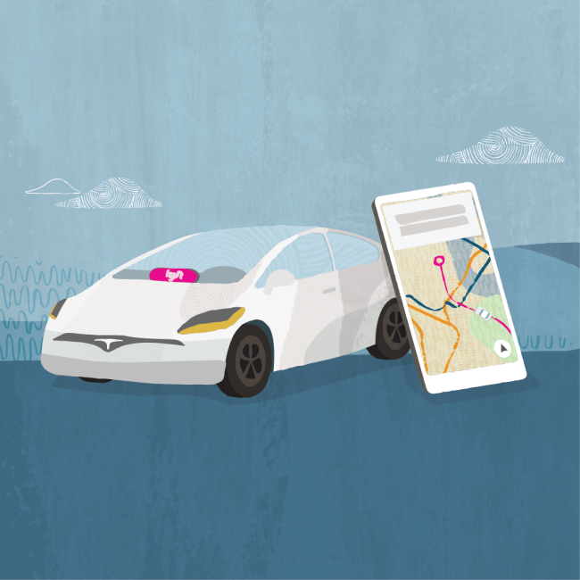
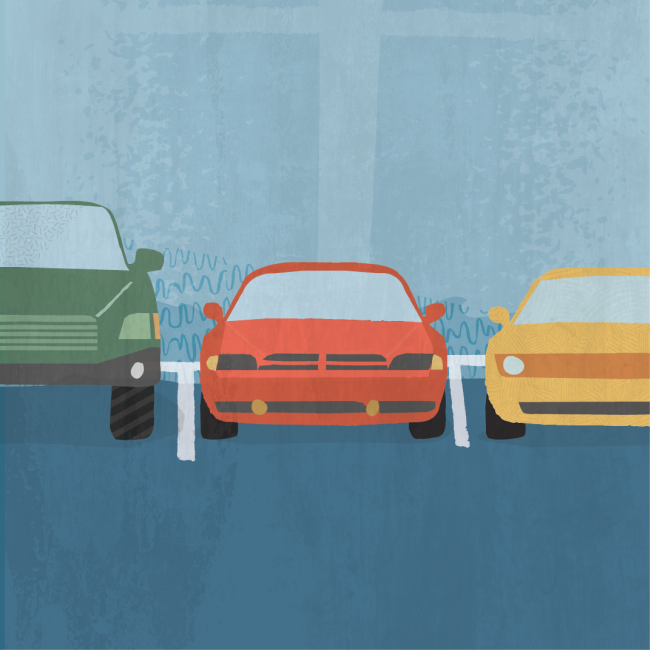
The illustrations needed to clearly communicate each type of action, representing scenarios from hotel accommodations or car rental, to a meal with a prospective customer. Among the primary requirements was to follow the guidelines of the design system, expressing signature Redwood colors textures and tone, while expanding on the system to create a unique visual experience – crafted solely to elevate the ERP Expenses product.
Coming in after the project had already begun, I used a previous set of initial sketches as a starting off point from which we would establish the subsequent illustrations needed to be created.
Key to establishing a unified set of characteristics to consider, we needed to create a complete family of images, leaving to option to expand on our original concepts as needed.
REQUIRED IMAGES
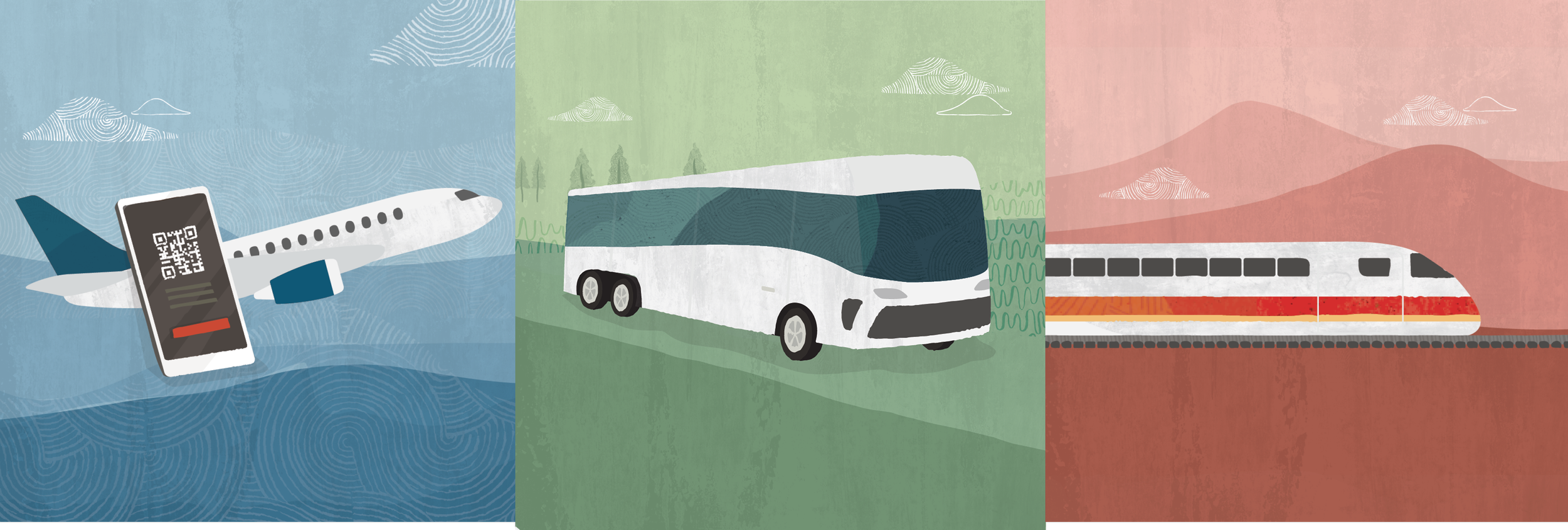
Train
Bus
Airfare
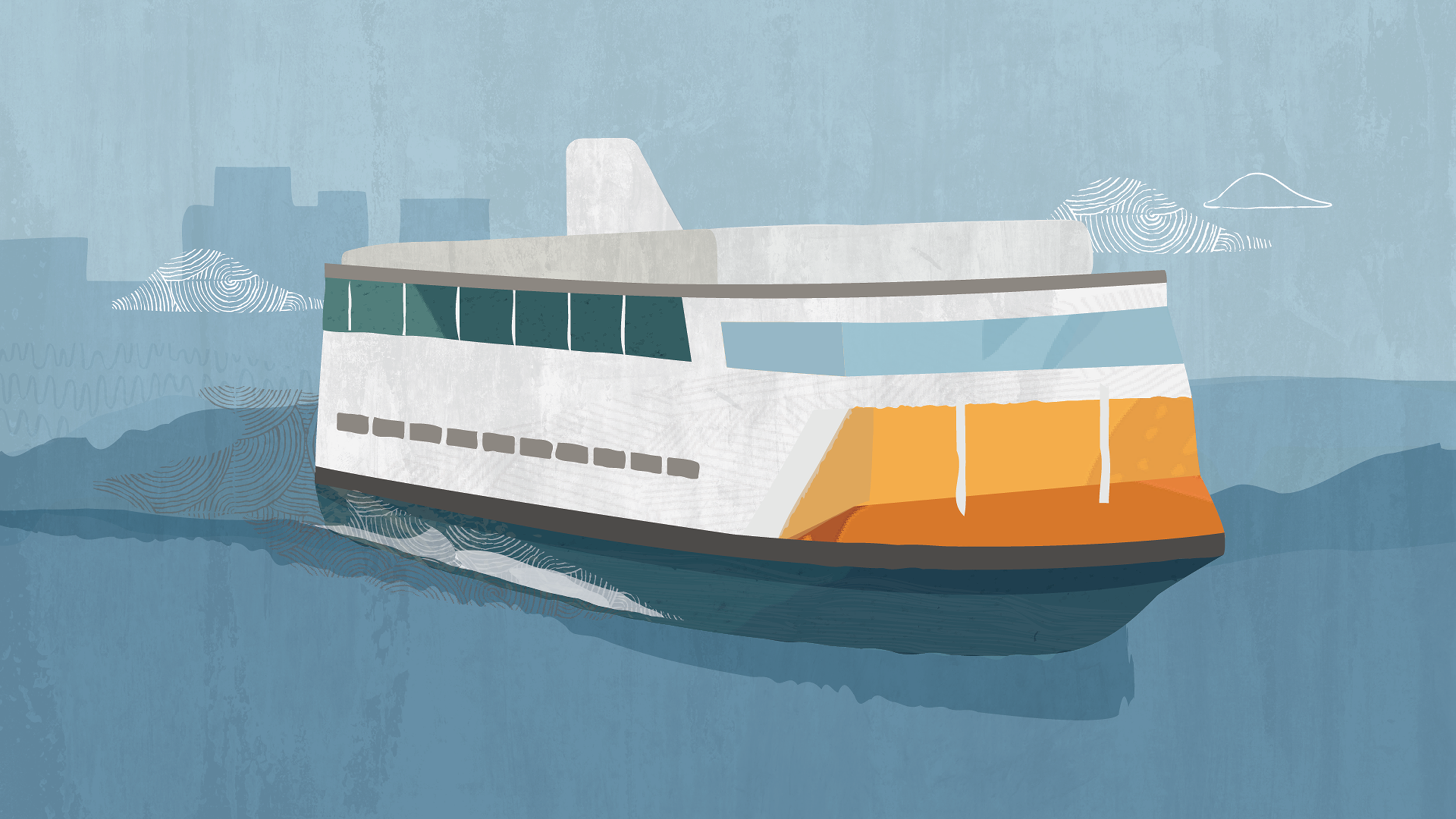
Ferry
Taxi
Ride Share - Uber
Ride Share - Lyft
Mileage
Car Rental
Parking
Refuel / Charging
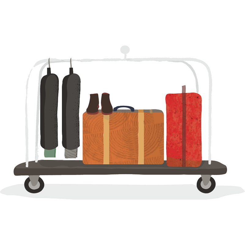
Accommodations
Entertainment
Credit Card
Meals
Miscellaneous
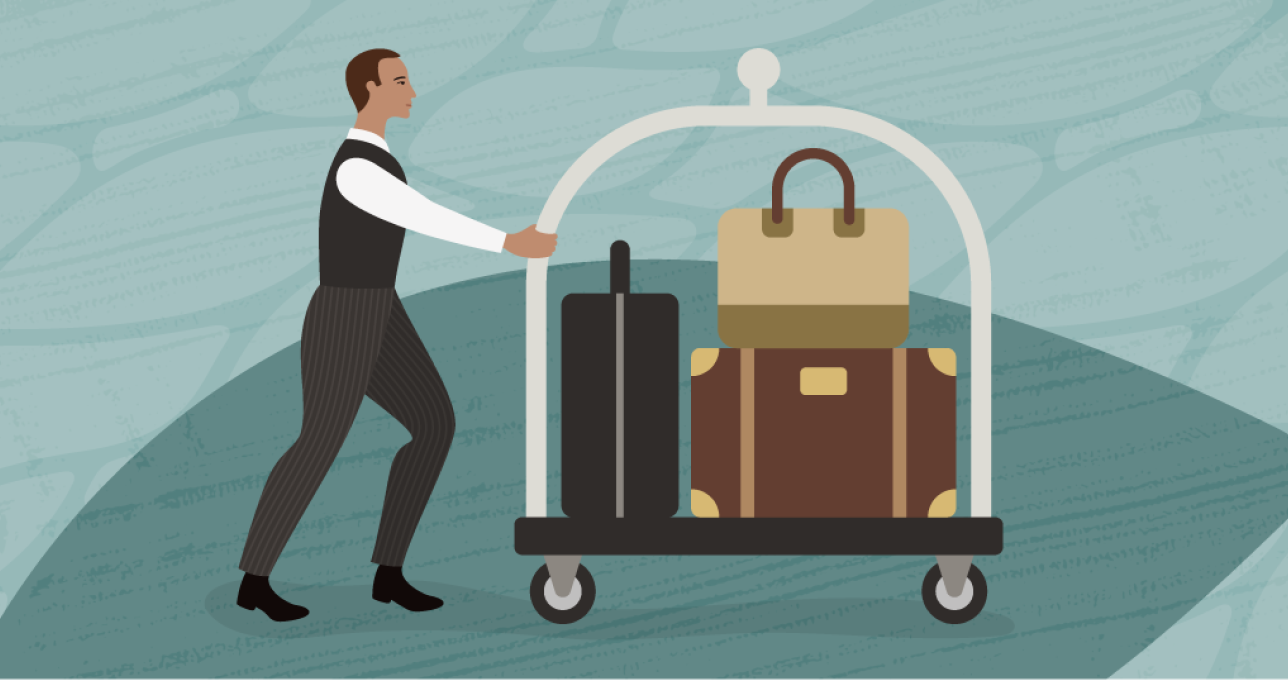
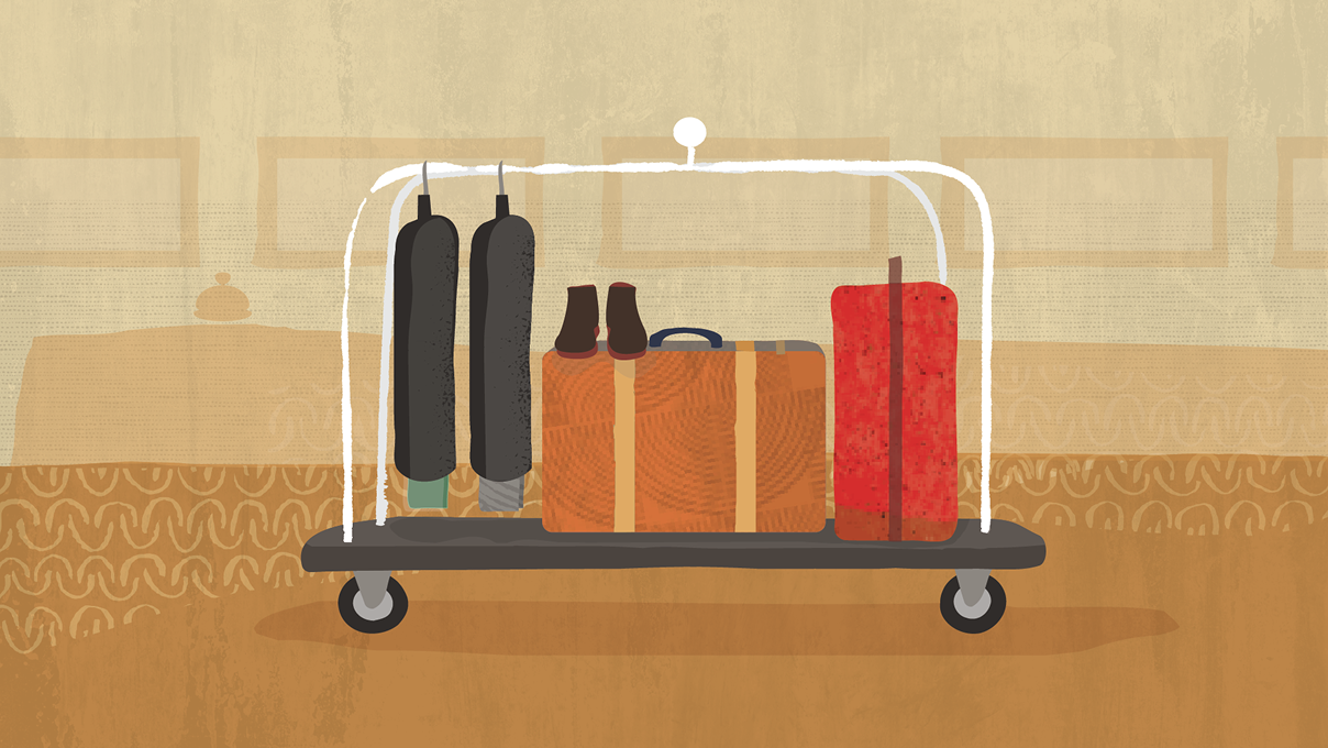
The sketches on the left were among those used as the foundation for the set of expense type illustrations. Featured here are samples of before and after illustrations. One of the primary goals was remaining loyal to the original concepts while evolving the visual tenets of the Redwood Design System.
Original sketches to final illustrations
BEFORE

AFTER
Define a unique palette as a subset of the Design System
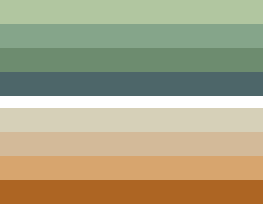
PRIMARY PALETTE
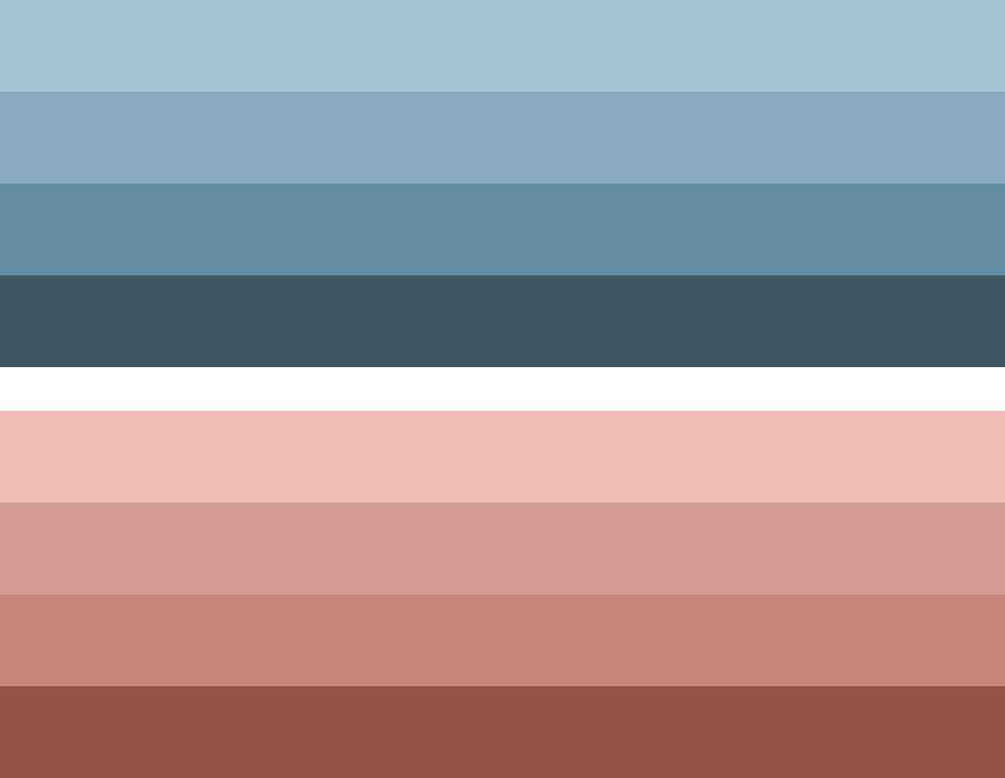
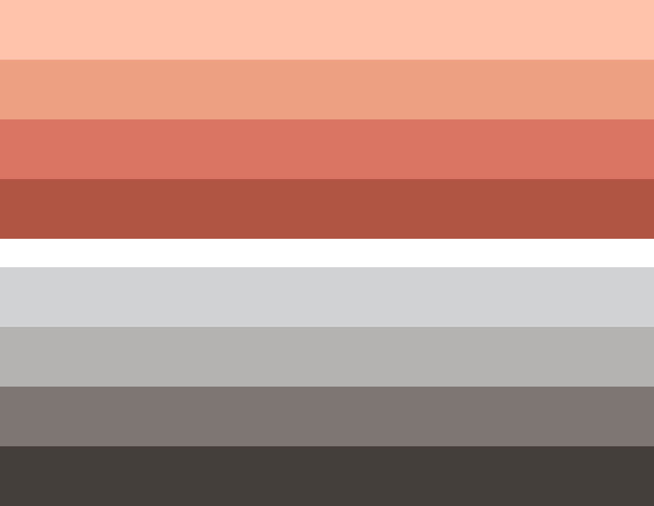
SECONDARY PALETTE
Exploration and Iterations
We began by identifying categories and building consistent brand elements, including an initial background treatment and characteristics of the vehicles. The goal was to not only feature the vehicles as central objects, but to show context for each individual subject and it’s environment.
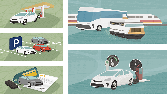
I introduced a supportive secondary elements to draw the user into the scene with simple, quickly identifiable cues. Incorporating neutral, receding shapes provided additional key aspects of the story–pushing the primary subject matter forward. We also Increased the overall contrast and saturation of color palette, while adding subtle asymmetric textured shapes in the background to make the primary objects stand out, moving closer to a more consistent visual effect.
Telling the Unique
Redwood Story
Preserving Redwood Textures
Increased the overall contrast and saturation of color palette, while added subtle asymmetric textured shapes in the background to make the primary objects stand out more, moving closer to a more consistent visual effect.

Meals
The original concept was to portray the environment in which the meal is being consumed – rather than the actual food itself to convey the experience. In the process, the aim was to remove potential stereotypes, ethnicities or geographic identifiers. Considering the diversity and endless possible variations, I approached four familiar backdrops for each distinctly different dining experience company employees regularly reported.
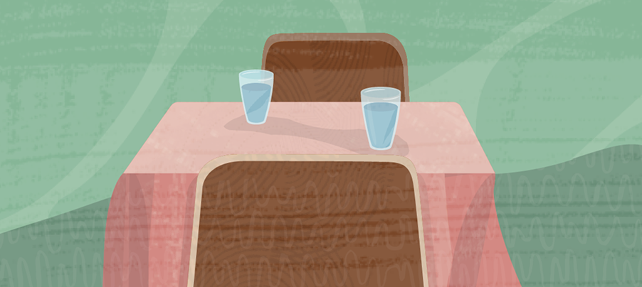
GENERAL RESTAURANT
A meal consisting of a singular or one-on-one dining experience
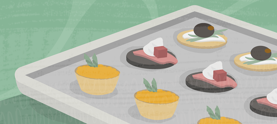
CATERED EVENT
colorful hors d’oeuvres positioned
on a serving tray
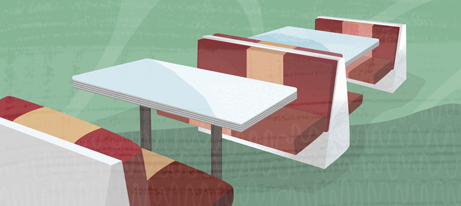
FAST FOOD
A configuration of booths typical of a familiar fast food restaurant interior
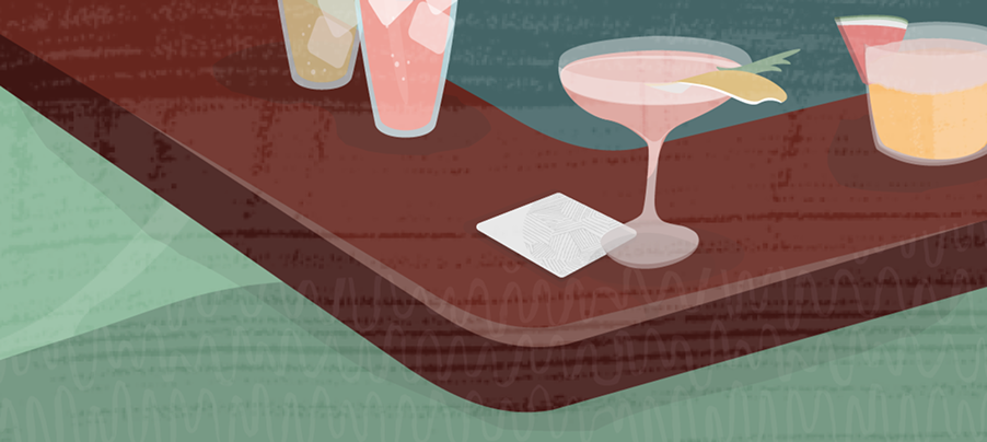
BAR / LOUNGE
A casual and social environment
Refinement
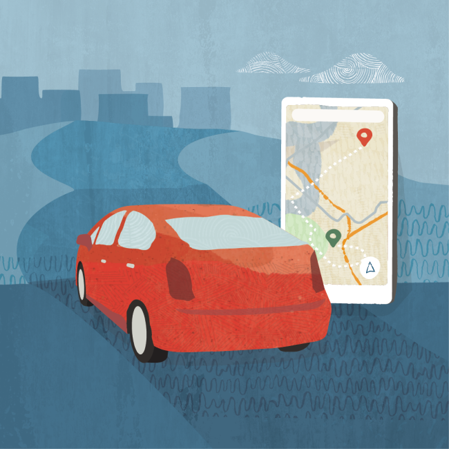
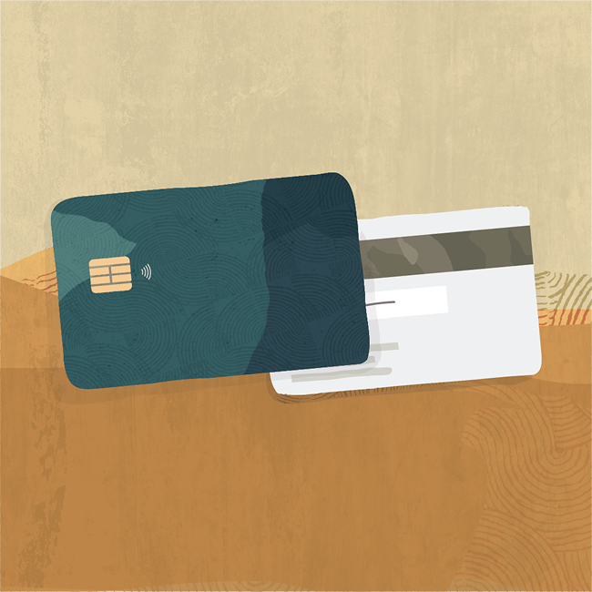
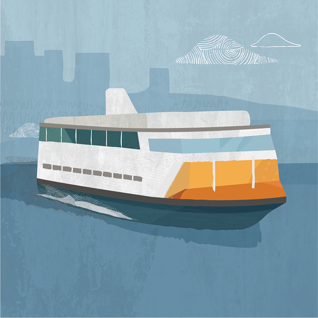
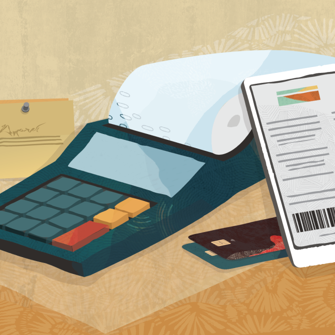
These images represent the final round of refinement of illustration set, bringing a consistency to the images through color, texture, tone and voice.
Individual Items
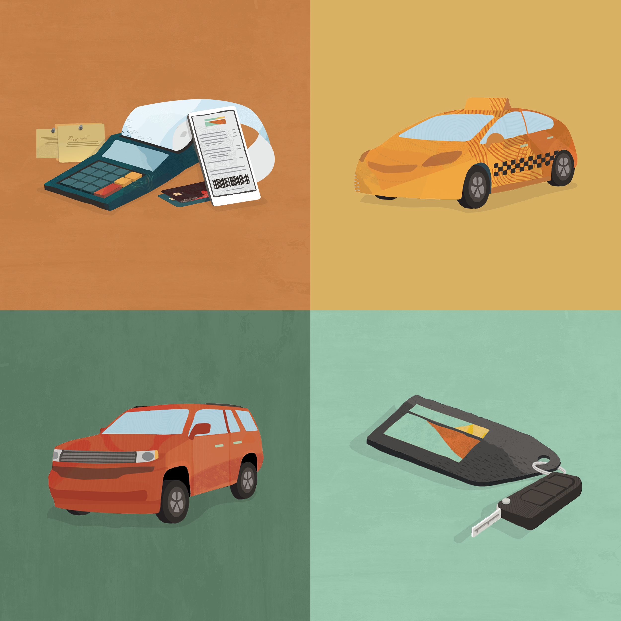
Primary elements were created to be extracted from the complete illustrations – created with the distinct purpose to expand the potential application of the assets, creating versatility and depth for the subjects they represent.
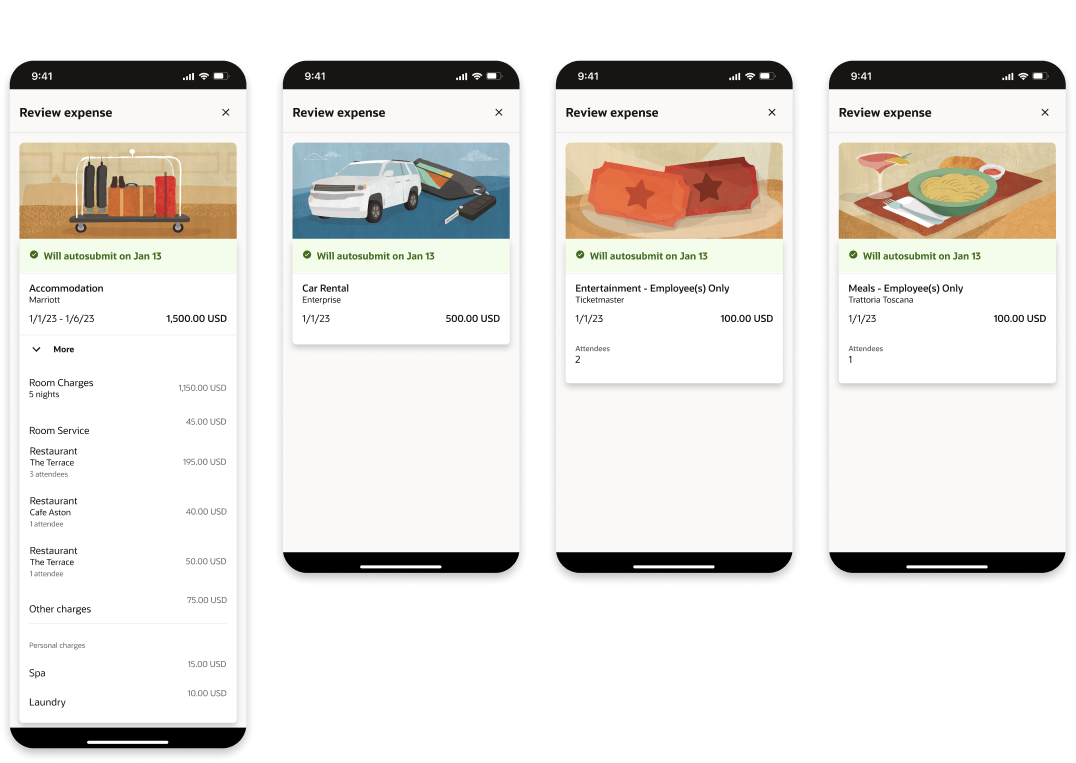
Illustrations Incorporated into the mobile app
Final Illustration Set
RESULTS
Delivering this complete family of illustrations directly answered the primary goalof the ERP Expense team – to create a vibrant and engaging proprietary set of images that elevated the end-to-end expense submission process.
Utilizing the the Redwood Design System as a starting off point, we were able to retain the tone of Redwood while also establishing a newly expanded language to create a rich, sophisticated user interface. We took a traditionally routine series of tasks and established a friendlier and more intuitive application.